Designers and developers today have more high-quality free icon sets available than ever before. Whereas a decade ago, it was common for the average UX/UI designer to spend time every week crafting custom icons, today this is more often the domain of large enterprises with considerable design resources. For early-stage startups and lean product teams, this is great news—you no longer need to spend months crafting custom icons or thousands of dollars on premium sets to ship a professional-looking product.
To be clear: custom icons can still be valuable for mature products with established design systems. But for most early-stage products, a well-chosen free for commercial icon set will serve you better than poorly-executed custom icons. The key is knowing what to look for and where to find them.
What to Look For
Not all icon sets are created equal. You’ll find a lot of icon sets masquerading as free, but which are really juts a limited subset of a larger paid icon set. Its generally better to avoid these, and instead go with a truly free, open-source icon set, which has ongoing contributions.
Consistency
Look for sets where every icon feels like part of the same family. This means consistent stroke weights, corner radii, and visual weight. Mixing icons from different sets is like using multiple fonts in a paragraph—it’ll look a bit off, and make your UI look less polished. To achieve consistency, icon sets should have a standard size frame, with slightly different size icons within that frame. This is done intentionally as different shapes have different visual weight — so adjusting the amount of space inside an icon frame allows designers to ensure the icons have the same visual weight. If you look at a square and circle with the same width/diameter, the square will look bigger as it takes up more pixels. To make them look balanced, the square’s width must be smaller than the circle’s diameter. The same principle applies to icons.
Legibility at Small Sizes
Icons need to be recognizable at the smallest size you plan to use them in your app. In most cases this will be 16px. However, for information-dense enterprise applications, this may extend down to 14px or even 12px. If you intend to use icons at smaller sizes, you should check icon legibility at that size when selecting a set. Very few icon sets offer different permutations—such as lower levels of detail—for smaller size icons. So even though a more detailed icon may look great at 24px, it may be illegible at the size you’ll actually use it.
SVG Availability
Always choose sets that provide SVGs. PNGs are a red flag—they don't scale, can't be customized easily, can’t be used with css transitions, and add unnecessary weight to your product. SVGs let you change colors and transition with CSS, adjust fills and strokes, and scale size infinitely. Look for clean, optimized SVGs without unnecessary layers or shapes.
Style Variations
The best sets offer both filled and outline variations. Having both available adds another dimension for you to indicate UI state without relying on color. That is, you can indicate an active state with a filled icon, as opposed to just making it an accent color. Filled icons are also better for smaller, denser interfaces like toolbars or mobile tab bars.
Clear Licensing
This is important for commercial use. Look for explicit statements about commercial usage and attribution requirements, not just "free" labels. Be wary of sets that require attribution for commercial use—this can become a legal headache as your product scales.
Size and Coverage
While you’re unlikely to need 10,000 icons, icon sets vary in the concepts they cover. Some may have coverage for technical concepts, whereas others may be more limited, and better suited to consumer apps. When considering an icon set, make sure you review whether the topics it covers include your use cases. For example, if you’re building a cloud infrastructure app, make sure the icon set covers things like servers, databases, storage, networks, CDNs, containers, functions, etc.
Agreement with Your Brand and Design System
Lastly, it’s important to choose an icon set that fits the same vibe as your brand and design system. For example, an icon set that uses highly-rounded corners may look great in a friendly, consumer-app — but may look odd in a highly-technical B2B app. The same goes for other icon qualities like their visual weight, which should be balanced with the visual density of your app. Overly thin icons will look odd in a very dense app. Fortunately, some icon sets allow you to customize the stroke width, which gives you more leniency.
Understanding Free Licenses
Before diving into the icon sets, it's worth understanding the most common licenses you'll encounter.
MIT — The most popular permissive license. You can use, modify, and distribute icons freely in commercial products. While you must include the copyright notice and license text somewhere in your project (usually in a LICENSE file or documentation), you don't need visible attribution in your UI. This makes it ideal for commercial use.
Apache 2.0 — Similar to MIT but with extra protection if someone tries to sue you over an underlying patent. It requires preserving copyright notices and any Notice file if provided. Like MIT, it doesn’t require visible attribution in your UI. This is generally what legal would recommend for enterprise use.
Creative Commons (CC) — These can vary significantly, so be sure to check carefully if you see “CC”.
- CC0: Public domain. No attribution required anywhere.
- CC BY: Requires visible attribution (e.g., in your app's credits or documentation that users can access).
- CC BY-SA: Requires attribution plus sharing any modifications under the same license. Generally avoid for commercial products.
Custom "Free" Licenses — Some creators write their own terms. These can be vague or have unexpected restrictions, so always read carefully and consider whether you can just use an icon set with a clearer license like MIT or Apache instead.
Bottom line: Stick with MIT, Apache 2.0, or CC0 for commercial projects. They're legally clear, widely understood, and won't create compliance headaches. The key distinction is that MIT and Apache require preserving license text in your codebase, whereas CC BY requires attribution visible to end users.
Icon Sets
Material Icons
2,500+ icons x 3 styles | Apache 2.0 | fonts.google.com
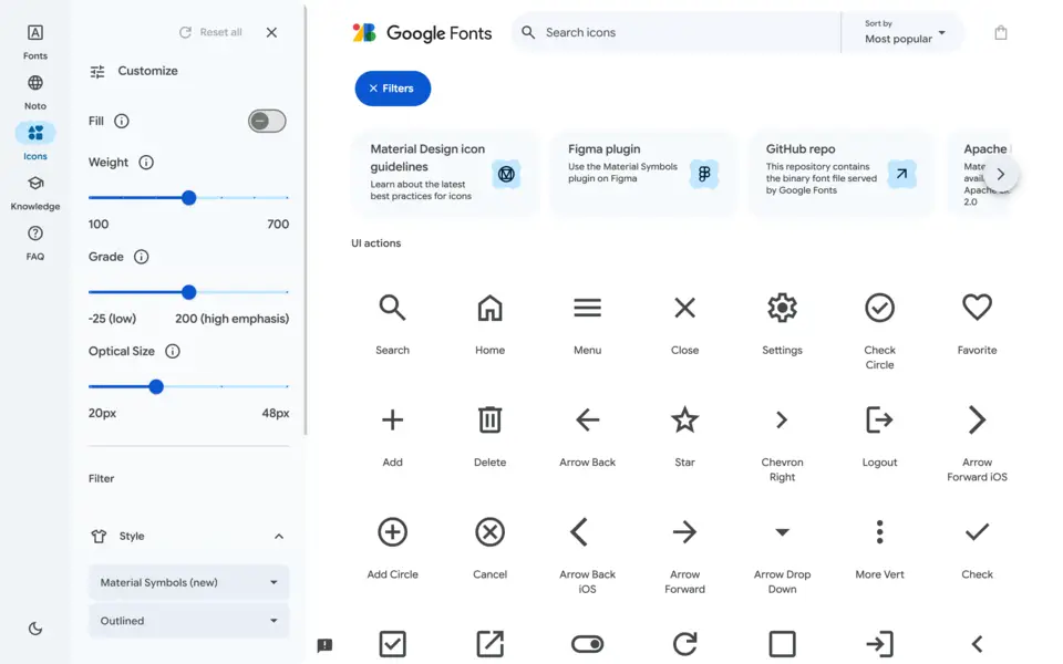
Google's Material Symbols (formerly known as Material Icons) offer five styles: outlined, rounded, sharp, filled, and two-tone. While some designers find them overused, they're one of the cleanest, most comprehensive sets available, and well-tested across billions of users.
The variable font version lets you adjust weight, fill, and optical size with CSS. However, be aware that the Material Design aesthetic is quite specific and some icons mix line and fill in ways that can feel inconsistent. The sheer size also means quality can vary between icons. Still, for projects that need extensive icon coverage with a proven design system, Material Symbols is a great choice.
Lucide
1,614 icons | MIT License | lucide.dev/
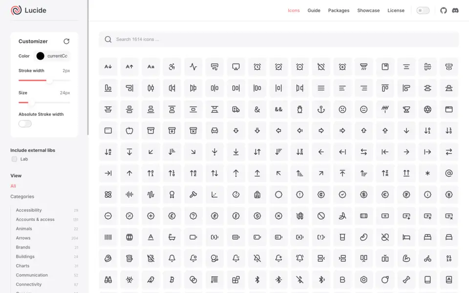
Lucide is a community-driven fork of Feather Icons that's become the go-to for many startups. The icons are minimal, professional, and work beautifully at small sizes. With an actively growing collection of 1,600+ icons, it covers most use cases. The 24x24px grid with 2px strokes is is a great fit for friendly, modern UIs. However, note it doesn’t have filled variants, and is fairly rounded, so it may be better suited for consumer and simpler B2B apps than for complex enterprise applications. What sets Lucide apart is its active community, which continues to expands the set regularly.
Phosphor Icons
1,512 icons x 6 styles | MIT License | phosphoricons.com
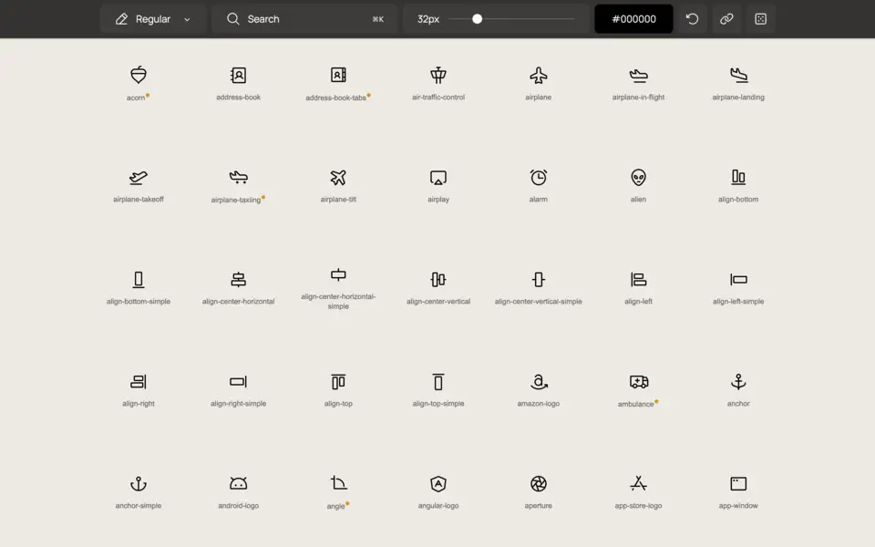
Phosphor provides a unique, highly-customizable icon set with six variations: thin, light, regular, bold, fill, and duotone. They have a modern, playful style which adds more personality than the average icon set. The duotone style in particular is great for adding more brand expression.
Heroicons
316 icons x 4 styles | MIT License | heroicons.com
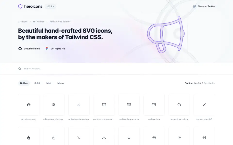
Created by the makers of Tailwind, Heroicons is a great set of 316 minimalist icons, with four style variations—outline, solid, mini, and micro. Although there’s not huge coverage in terms of icon symbolism, the micro set are some of the most legible icons available at small sizes. This set is great for teams already using Tailwind, with pre-added Tailwind classes for seamless integration, and available as SVGs, React components, and Vue components.
Remix Icon
1,529 icons x 2 styles | Apache 2.0 | remixicon.com
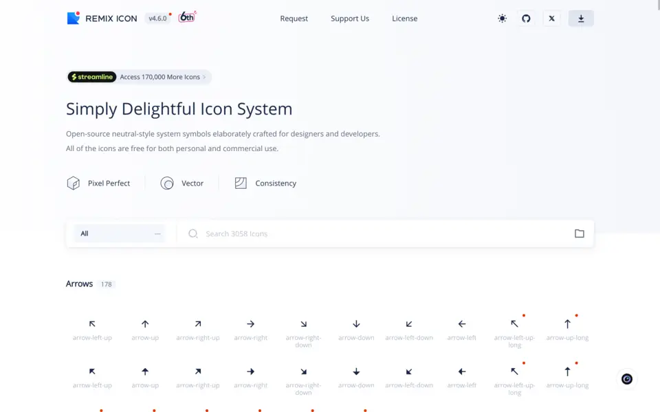
Remix provides an extensive set with line and fill styles. They’re fairly neutral style-wise, so they work well across a range of UI styles. However, note that they’re quite angular, so may not be as well-suited to a colorful consumer app as a set like Lucide or Phosphor.
Iconoir
1,671 icons | MIT License | iconoir.com
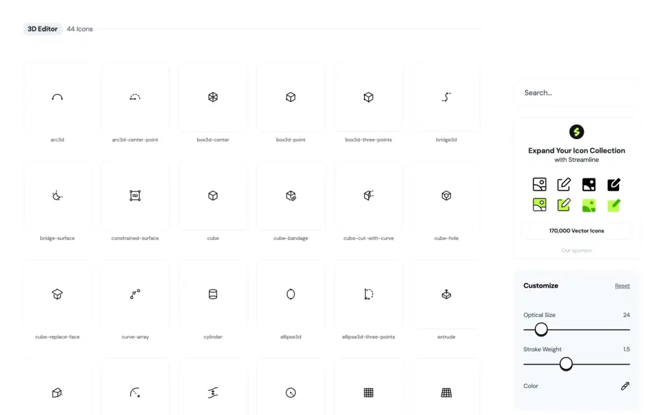
Iconoir provides a softer, more casual look, which is well-suited to spacious consumer interfaces. It includes some unique icons—like spock-hand-gesture—which can add a nice sense of playfulness to your UI.
Icon Park
2,658 icons x 4 styles | Apache 2.0 | iconpark.oceanengine.com
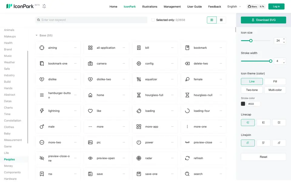
Icon Park offers a comprehensive collection with four styles: outline, filled, two-tone, and multi-color. What sets Icon Park apart is its sophisticated customization system—spanning stroke widths, theme colors, linecaps, linejoins, and even individual icon colors. The two-tone and multi-color styles are particularly good for increasing brand expression. The icons follow a consistent 48x48px grid and are available as SVG, React components, Vue components, and even icon fonts. This set is surprisingly underused compared to the above sets, despite its permissive Apache 2.0 license.
Tabler Icons
3,000+ icons | MIT License | tabler.io
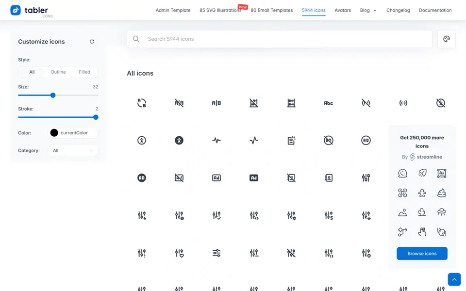
Tabler offers one of the largest free sets available. Although the visual style of this icon set can feel a little immature, its breadth more than compensates, and it’s not a bad choice for consumer apps.
css.gg
704 icons | MIT License | css.gg
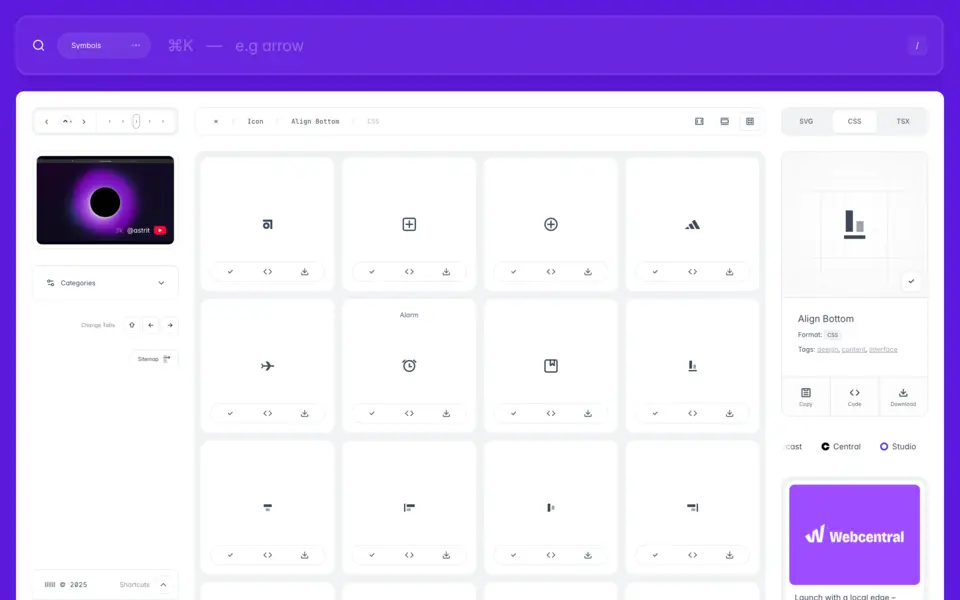
css.gg is unique in that every icon is crafted in CSS. Although you can download SVG versions, the CSS options make them incredibly lightweight and customizable. They have a distinctive, slightly geometric feel that works well in modern, technical products, and are perfectly suited for css transitions. They're particularly popular among dev tools and technical SaaS products given the appeal of full CSS customization.
IBM Icons
597 icons | Apache 2.0 | ibm.com
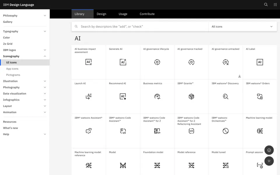
IBM's icon library provides reasonable breadth with a unique style. Although it lacks much in the wya of customization, it really shines in a handful of specific technical contexts, where its coverage is far better than other libraries. For example, for Artificial Intelligence, it has icons for models, foundational models, tuned models, prompt templates, AI governance, etc. Similarly, for Data Visualization, it has icons for logistical regression charts, planning waterfall charts, treemap charts, choropleth maps, candlestick charts, etc.
Doodle Icons
400+ icons | CC BY 4.0 | khushmeen.com
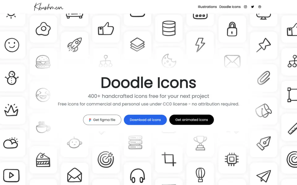
For projects that need a bit more personality and approachability, Khushmeen Sidhu’s Doodle Icons offer a hand-drawn aesthetic that's rare in free icon sets. Although these are more often used for marketing sites, they’re a great way to add some personality to empty states or splash screens.
Conclusion
A decade ago, crafting custom icons was table stakes for any serious product. Today, the quality of free icon sets has increasingly shifted custom icons towards the exclusive domain of large enterprises with dedicated design resources. For everyone else, there’s little reason not to leverage one of the professionally-crafted, open-source sets.
The key is choosing wisely. Pick an icon set that aligns with your brand personality and has sufficient coverage for the concepts related to your product. Consumer apps might gravitate toward the playful curves of Lucide or Phosphor, whereas enterprise tools may prefer the precision of IBM or css.gg. Need extensive coverage? Tabler's 3,000+ icons have you covered. Building with Tailwind? Heroicons integrates seamlessly.
Once you've chosen, implement consistently. Resist the temptation to mix sets or over-customize. Document your usage patterns. And remember: your users don't care if your icons are custom—they care that they’re legible and unambiguous.
With these high-quality, legally-clear icon sets at your disposal, there's no excuse for poor iconography in 2025. Let these open-source communities handle the icons while you focus on what actually differentiates your product: solving real problems for real users.


